How the components have utilised understanding of research undertaken on real media products.
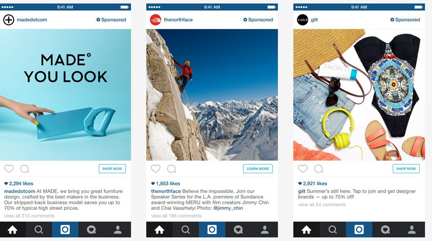
It is very easy for people to learn and copy ideas from media products. Taking out research tasks allows individuals to get a real clear idea of what they want the product that they may be creating to look and be like. For example, The share a coke campaign has a very clear and simple image to the campaign that links in very well with their brand as a whole. Looking at this campaign could allow individuals to gain new ideas around the idea of share a coke. Gaining and collecting new ideas through the use of media products is extremely helpful and helps individuals to create new and exciting pieces of media.
When creating my own media products I had done lots of previous research on many different advertising and media products. This helped me and my group to get an idea of what we wanted to include in our media products in regards to font, text, images and colour scheme.
When making our magazine advert, video advert and billboard advert we made sure that all three of them linked extremely well together and all had the same colours, fonts and similar images on them. This was so that audiences could easily recognise our product and for it to become more popular more quickly.
The planning part of a media product is extremely important. This is because when a plan is in place of what the adverts are going to like it allows the creating and editing process to become a lot easier and clearer to do when making them. When I created a research portfolio and looked at two different campaigns which were 'Share a coke' and the Dumb ways to die campaign. When looking at both of these I researched into them to see exactly what advertisement they had and the codes and conventions that they used. For example, the 'Share a coke' campaign had a video advert, billboard advert and was advertised all over social media. This campaign was extremely successful all around the globe and individuals were walking around with a bottle of coke with an individuals name on the bottle.
When creating my own adverts i had to use a load of different codes and conventions to allow our finished products to look professional and eye catching for our target audiences.
One of the main codes and conventions was the use of having an ongoing colour scheme was one of the most important codes and conventions in regards to our products. This is because our drink was going to be a bright red colour. We wanted to show audiences that our new product was bright, enthusiastic and had a retro and funky theme to it. The colours that we used were also extremely eye catching because they are all bright and bold colours. The can of our product is also bright red so when creating our adverts we decided to choose a deep purple colour that contrasted well to allow the product itself to stand out. This code and convention was used across the campaign to create brand identity.
When creating our video advert we ensured that the product shot was clear. We ensured that we included a clear shot of the products so that viewers were sure about what our product is and what we are showing. The point in having a product shot on screen for a couple of seconds focusing on our products allows viewers to know exactly what is being shown. We also used a quick transition from the main content of our video to the ending title page. We did this so that there was enough time showing the last page that included our information about the product. Transitions are in place to ensure the video advert runs smoothly and looks real and professional.
The Narrative of our adverts are created by all of the codes and conventions. For example, the music, colour scheme, tones and fonts of our adverts allow the adverts and product to have a narrative. The backing track we decided to use allows individuals to get a feel of the narrative and the feeling that we wanted to put across for our product. The music gives off a retro and excited vibe which allows individuals to want to go and buy our product and taste the drink.
Another main convention that was important was the use of sound when making our video advert. We decided to go with an upbeat, funky piece of music. We chose this music because it fit really well with the content in the video and the idea of our drink coming to life. The idea behind our drink coming to life is because the taste of the drink is so good it gives individuals lots of energy. The backing music in our video has an extremely fun tone to it.
The images we used on our billboard and magazine advert were also very bright and eye-catching images. For example, one of the main images on our adverts is of a cartoon boy drinking a can of PhizzWizzard. When creating this we had to edit an image of our own can into the cartoon boys hand. This image allows audiences to want to look at what he is drinking and then want to buy the drink that he is drinking. We also made sure that all of the fonts that were chosen were put on both adverts so that all three match together. The font chosen reflected strawberry laces, which was a key element of the brief.
Ensuring that advertisement is put all over social media is extremely important. This is to ensure that the advertisement that is created becomes popular and gains more viewers. Social media is one of the biggest and most successful media platforms today and it is a great way to advertise products. It allows people to view things via other individuals profiles because they may have shared it. This is how videos and images go viral and become successful and popular.
On all three of our adverts we ensured that our company logo was included on all three of our adverts in the same font and colour. Again, we did this so that we can build and create our own brand identity which will allow our products to become more popular and successful and will help us to build a bigger target audience.
Magazine and Billboard adverts.


Screenshots of the main screen in our video.
End page of our video.
There are also many codes and conventions that we didn't include in our adverts. For example, when creating our video we decided to add a backing track rather than having a voice over. Initially we did this because we felt as if music can give off a better type of mood in comparison to someone talking. We also wanted our video advert to look professional and we felt as if we used a voice over it may have come across unrealistic and may not have suited our mature theme. However, looking back and reflecting on the products that we created we felt as if the voiceover was missing and it may be added at a later date.
We have created a brand identity by ensuring that all three of our products contain the same codes and conventions on their adverts. This creates a brand identity by showing to audiences that all of our adverts link together and are all advertising the same products.
No comments:
Post a Comment